 A4 Front Page Studio
English Project File Cover Page Guide: Neat, Formal and Readable
An English project file is different from most others: it is about words, so the cover should feel like it was written by someone who cares about words. That usually means calm spacing, a thoughtful title font and a tidy, balanced layout, rather than a lot of bright decoration. Whether the file holds a literature study, a book review, a creative writing portfolio or a grammar project, the cover sets the tone for what follows. This guide explains how to design a neat, formal and readable cover for an English file, what details to include, and how to avoid the mistakes that make a literary cover look messy.
Choose a calm, literary tone
Teachers of English tend to appreciate clarity and restraint. A cover that has a simple frame, a generous amount of space and a title in a refined font looks appropriate for most English work. Brighter, more playful covers can suit younger classes or creative writing portfolios, but even then a single clear title is better than a crowded page.
- Literature study: formal, with a serif-style or elegant title and a quiet palette such as navy, maroon or deep green.
- Book review or reading journal: friendly, with a small illustration such as an open book and soft colours.
- Creative writing portfolio: expressive, with a more decorative title and one accent colour.
- Grammar or language project: clean and plain, with a tidy details block.

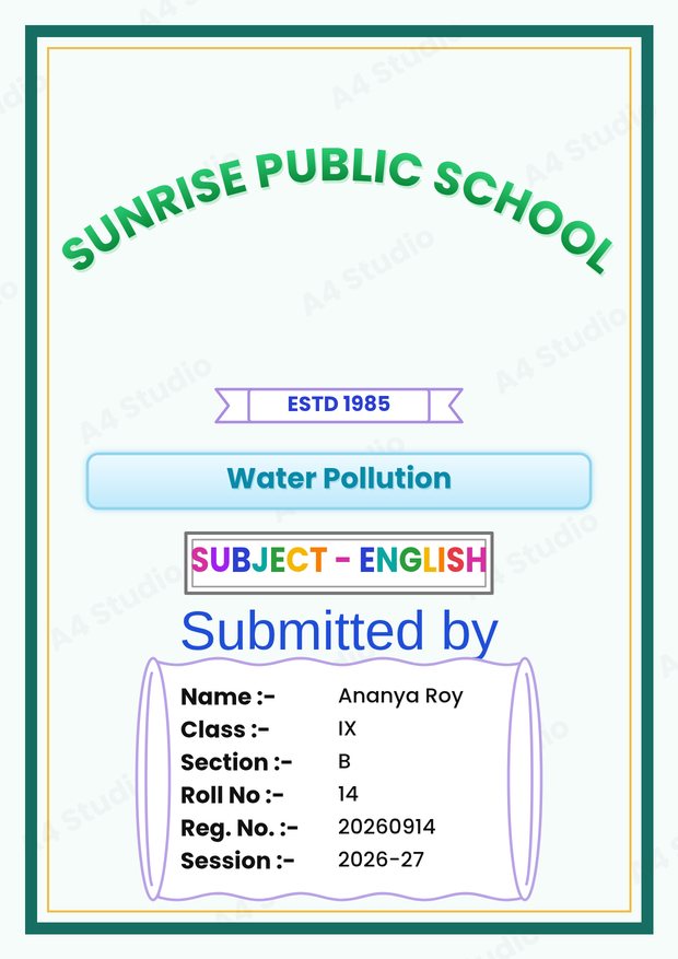
What to include
An English cover needs the same core details as any other project cover, and a few extras that help the reader identify the work.
- The title of the project, such as “A Study of Character in Oliver Twist”
- The subject line, “English” or “English Literature”
- Your name, class, section and roll number
- The teacher’s name and the session
- For a book study, the name of the book and its author, either in the title or in a small subtitle
Check the spelling of every proper name: the author, the characters and the title of the book. A spelling error in the title of the book you are studying is one of the most embarrassing mistakes on an English cover. Our general checklist in what to include on a cover page will help you cover the rest.
Fonts for English covers
This is the subject where fonts matter most. A refined serif font gives the title a traditional, literary feel. A simple sans-serif is a good choice for the details block. Handwriting or script fonts can look lovely on a short title for a creative piece, but they are hard to read in long lines, so keep them to a few words. Capital letters work for short titles, but a long title in capitals becomes tiring to read; use capitals only for the school name or a short subject line. Our guide to choosing and pairing fonts has more examples.
Formatting long titles
English project titles are often long. A few tricks keep them tidy:
- Break the title at a natural point, such as after a colon, instead of at a random width.
- Put the main part in large type and the subtitle in a smaller size beneath it.
- Keep each line roughly the same length so the block looks balanced.
- Use italics for the names of books and plays, and plain quotation marks for the titles of short stories and poems, if your teacher follows that convention.
Decoration: less is more
A single quiet decorative element is enough: a thin frame, a small book or quill motif, or a line under the title. If you add an illustration, keep it small and place it away from the details block. A page full of cartoon books and pens looks childish and hides the title.
Colour
For literature, deep blues, maroons, forest greens and warm creams give a classic feel. For creative writing, one brighter accent, such as a soft orange or lavender, adds personality. Whatever you choose, use near-black text on a pale background so the cover stays readable. See colour combinations that work for tested pairings.
A worked example
For a class 10 literature file on a novel, a good cover could have a thin maroon double border, the school name at the top in capital letters, and the title in a large serif font in the middle: “Great Expectations: A Character Study”. Under it, a small line reading “English Literature”. Below that, a details block with name, class, section, roll and registration number, then “Submitted to” with the teacher’s name. The session sits at the bottom. The palette is maroon, cream and dark grey, with a single font family used in two weights.
Make the inside pages match
If the cover uses a particular font, consider using the same one for the headings inside the file. Matching typography across the cover, the acknowledgement and the index makes the whole file feel designed. The guide on writing an acknowledgement and index shows how to keep those pages in step with the cover.
Making it in the tool
With the Front Page Maker, pick a design with a quiet frame and a text template that has a title and a subject line, then type your title and details. Use the colour tools to match the frame to your title colour, and use the move tools to nudge any line until the spacing looks even. When you are happy, save it as a PNG or PDF.
Mistakes to avoid
- Misspelling the name of the book, the author or a character
- Setting a long title in a script font
- Using too many decorations and too much colour
- Mixing centred and left-aligned text without a reason
- Leaving the subject line out
Quick answers
Should I put a quote on the cover?
Only if your teacher asks for one. A short, accurate quotation can look nice in a creative portfolio, but it should never crowd the details.
Can I use a picture of the book?
You may, but a photograph of your own copy is safer than a scan of a book cover, which may be protected. Keep the picture small and neat.
Is a plain cover acceptable for English?
Yes. A plain, well-spaced cover with a good title font and correct details is often the best choice.
An English cover should feel as careful as the writing inside it. Choose a calm tone, give the title a good font, check every name for spelling and keep the decoration light. That is all it takes to make an English file look thoughtful from the very first page.
Open the free A4 Front Page Studio →