 A4 Front Page Studio
Best Fonts for a Project Front Page (and How to Pair Them)
Fonts decide whether a cover page looks calm and clear or messy and hard to read. Most students never think about them and simply keep whatever the first template gave them, then wonder why the page feels off. The good news is that you only need a few simple rules. This guide explains how to choose a font for the title, how to choose another for the details, how to pair them so they work together, and what to check before printing. Along the way you will see covers made with very different type styles, so you can judge the effect for yourself.
Give each font a job
A cover page has two kinds of text, and each needs a different kind of font.
- Display text is the title and the school name. It is big, short and meant to catch the eye. Decorative, bold or curved fonts are fine here.
- Reading text is the name, class, roll, session and teacher details. It is small, factual and must be clear at a glance. Plain, simple fonts are best here.
When both kinds of text use the same showy font, the page becomes tiring to read. When both use a plain font, the page can feel dull. The fix is to let the title be expressive and the details stay quiet.
Common font styles and where they fit
| Style | Feels | Best for |
|---|---|---|
| Rounded sans-serif | Friendly, youthful | Junior and middle-school titles, creative projects |
| Clean sans-serif | Modern, neutral | Details blocks, science and mathematics |
| Serif | Formal, traditional | English, history, board-style covers |
| Handwriting or script | Personal, warm | Short titles and art projects, never long text |
| Heavy display | Bold, energetic | One-line titles on creative covers |
Pairing fonts without a design degree
Pairing is easier than it sounds if you follow three habits.
- Contrast, but not too much. Pair a bold or decorative title font with a plain details font. Two decorative fonts compete for attention.
- Limit yourself to two or three fonts. One for the title, one for the details and, at most, one more for a small accent such as the session.
- Use weight and size before adding another font. Bold, regular and italic versions of one plain font can handle labels, values and notes.
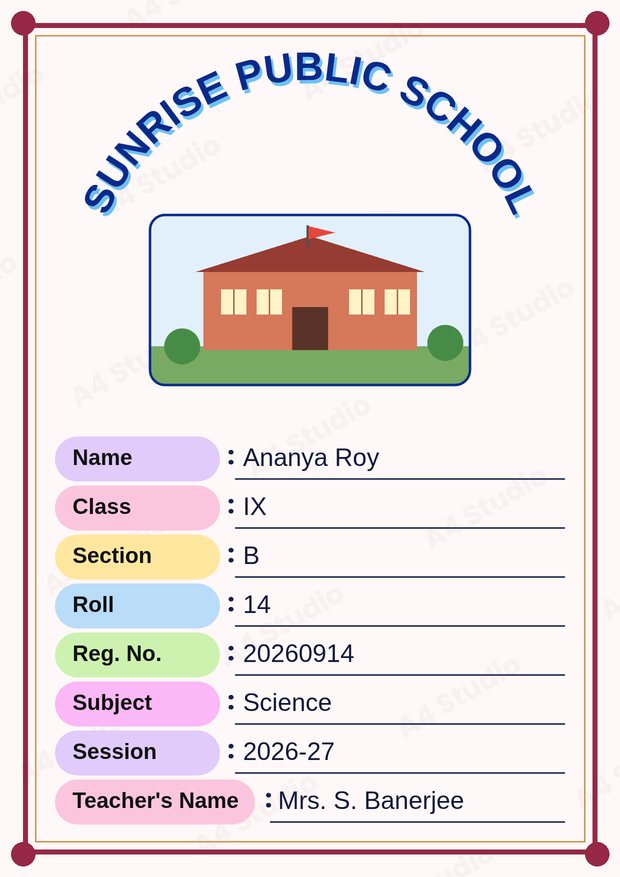
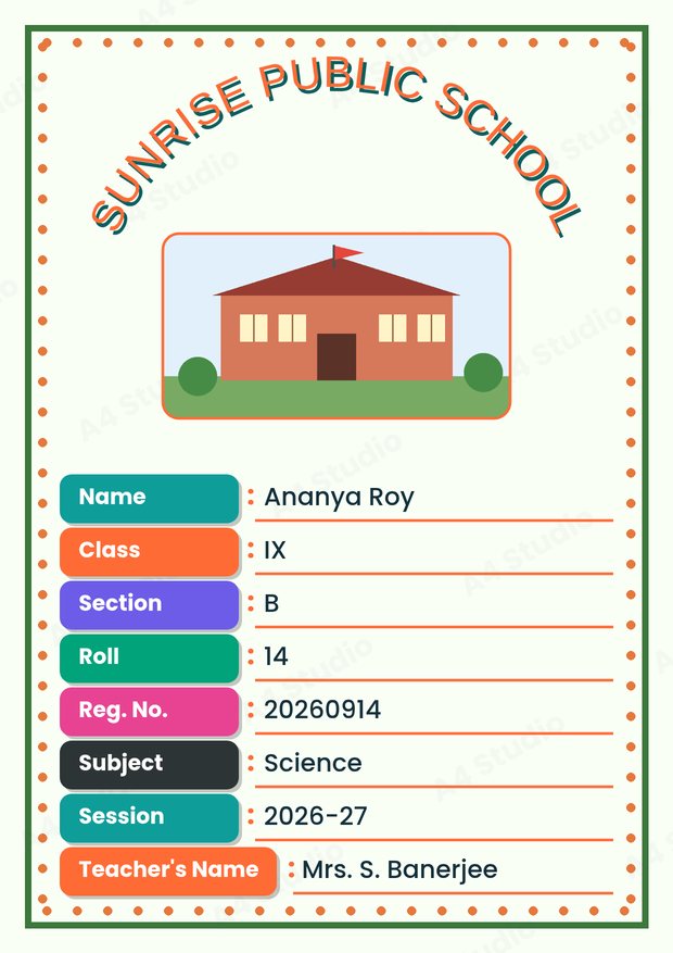
In both covers the details text is simple and the title carries the personality. That is the pattern to copy.
Choosing sizes that survive printing
Text that looks fine on a phone can be too small on paper. A cover is printed on A4, which is about 21 by 29.7 centimetres, and the reader may glance at it from a distance, so use these starting points:
- Title or school name: the biggest text on the page, easily readable from across a desk
- Subject and class: clearly smaller than the title but still bold
- Details block: large enough that the smallest line is comfortable to read at arm’s length
- Session or date: the smallest text, but never tiny
If you must shorten a line to fit it, make the text a little smaller or abbreviate sensibly, such as Reg. No., instead of squeezing the letters together.
Capital letters, spacing and alignment
- Capital letters work well for short titles and school names, but long sentences in capitals are hard to read.
- Keep line spacing generous in the details block so the rows do not touch.
- Align the details block consistently: either all left-aligned or all centred, not a mix.
- Use the same alignment for related items. If the labels are left-aligned, the values should line up neatly beside them.
Writing in Bengali, Hindi or other scripts
If your cover includes text in Bengali, Hindi or another script, check that the font supports every character you type. A font that does not support a script falls back to a default one, which can break letter shapes and spacing. Preview the page and read every word. If some characters look wrong, choose a font made for that script. Mixing scripts on the same line is fine as long as both look balanced.
Readability and contrast
A beautiful font is useless if the text is hard to see. Use dark text on a light background or light text on a dark one, and avoid text over busy pictures. Our guide on colour combinations that work covers contrast in depth. As a quick test, squint at the page: if any line disappears, it needs a stronger colour or a plainer background.
Check fonts before you print
- Preview the page and look for letters that overlap or break.
- Make sure the text is not cut off by the edge of a box.
- If the file will be opened on another device or at a print shop, save it as a PDF or PNG so the fonts cannot change. See PDF or PNG: which should you choose?
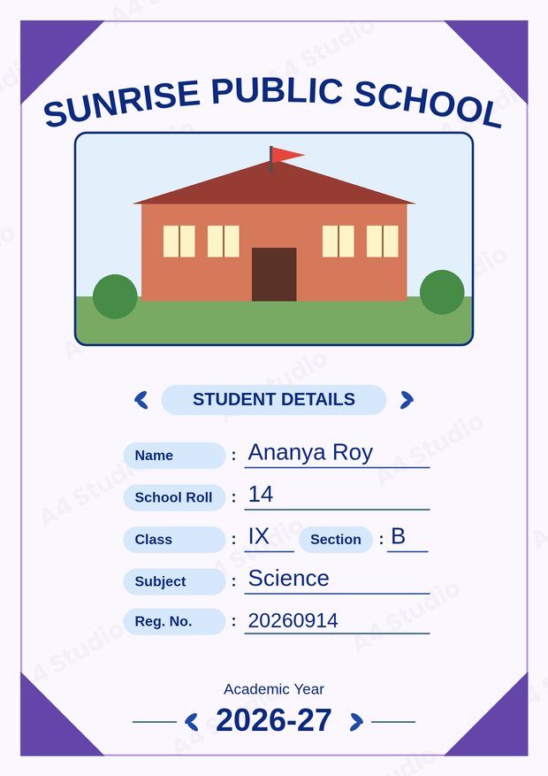
In our Front Page Maker the text templates already pair a title style with a matching details style, so you can choose a look and focus on typing the right details. You can still move, resize and recolour any piece to fit your page.
Font mistakes to avoid
- Using three or more decorative fonts on one page
- Setting long sentences in a script or handwriting font
- Making the details text too small to read
- Mixing alignments without a reason
- Ignoring broken letters in another script
Quick answers
Which font is safest if I cannot decide?
A clean sans-serif for the details and a bold version of a simple serif or sans-serif for the title. It is neutral and reads well.
Can I use a handwriting font for my name?
Yes for a short name on a creative cover, as long as it stays easy to read. Avoid it for roll numbers and registration numbers.
Why does my text look different when I print?
Usually because a font was replaced on the device or because the file was scaled. Saving a PDF or PNG and printing at 100 per cent avoids both.
Give the title an expressive font, give the details a plain one, and keep everything large enough to read. With those three habits your cover will look deliberate and professional.
Open the free A4 Front Page Studio →