 A4 Front Page Studio
Front Page Design Ideas for Class 9 to 12 Projects
By class 9 the expectations around a project file change. Teachers still enjoy a bit of colour, but they also expect the cover to look tidy, readable and appropriate for the subject. A cover that suits a class 3 drawing file can look childish on a class 11 chemistry record, while a stiff, plain cover can feel lifeless on a creative project. This guide gives practical design ideas for senior classes: how to pick a layout, how formal to go, how to use borders and space, and how to avoid the habits that make covers look crowded. All the example covers were made in our free tool, so you can try every idea yourself.
Start with the tone you want
Before choosing anything visual, decide how the page should feel. Three tones cover almost every senior-school situation:
- Formal. Plain border, a strong title, a tidy details block and very few colours. Best for science records, mathematics files, economics and board-related submissions.
- Friendly. A little colour in the labels, a rounded title and a photo or illustration. Best for languages, social science and general class projects.
- Creative. A bolder title, richer colour and a strong decorative element. Best for art, design, media and anything where the teacher has asked for originality.
When in doubt, go formal. A formal cover almost never draws a negative comment, while an over-decorated one sometimes does.
Four layouts that work well
1. Title in the middle, details at the bottom
This is the classic project cover. The school name sits at the top, the title takes the centre, and a block of student details sits in the lower half. It is easy to read and hard to get wrong.
2. Header band with a details panel
A coloured band holds the school name, and a panel below lists the student and teacher details. It gives a modern, organised look and works well for subjects with long titles.
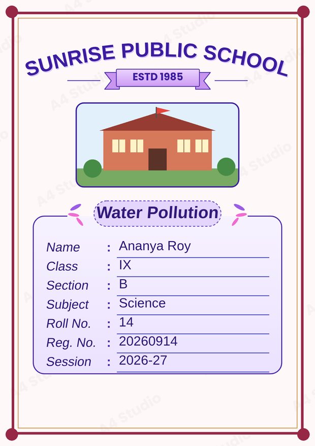
3. Photo-led cover
A photo or logo at the top, with a title below and a compact details block. Use it when your school has asked for a logo or when the project has an obvious visual theme.
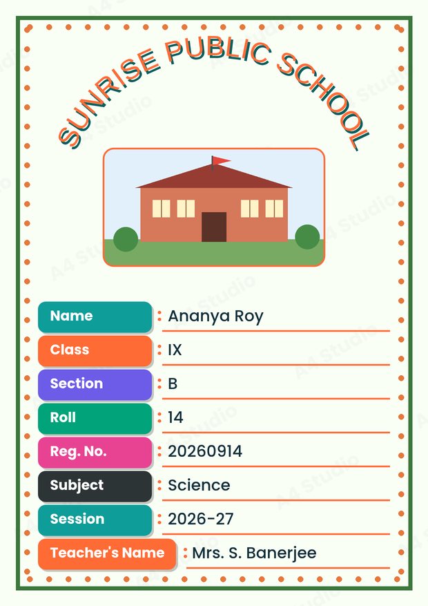
4. Label rows
Every detail has its own coloured label, such as Name, Class, Section and Roll. This layout is friendly and very clear, because the reader never has to guess what a number means.
Using borders and frames
A border pulls the page together and makes a printed sheet look finished. Keep these points in mind:
- A thin or medium border looks neat; a very thick, ornate border steals attention from the title.
- Match the border colour to one colour already used in the title or labels.
- Keep the border at least a few millimetres inside the paper edge so the printer does not clip it.
- For formal subjects, a simple double line is hard to beat.
Space is a design tool
Crowded covers are the number one problem in student work. If a page feels busy, remove something before you add anything. Leave generous space around the title, keep margins even and group related details together. Empty space tells the eye where to rest and makes the important parts stand out. As a rough guide, if less than a quarter of the page is empty, the layout is probably too full.
Pictures, logos and decoration
- Use one main picture, not several. A single clear school photo or logo looks better than a collage.
- Never stretch a picture. If it does not fit the box, crop it instead of squeezing it.
- Use a high-resolution file so the picture stays sharp when printed. Our guide on fixing blurry prints explains why.
- Keep stickers and clip art small and few, and keep them away from the details block.
Matching the subject
Small touches that relate to the subject make a cover feel considered. A leaf or cell motif suits biology, a sky or landscape suits geography, and a clean grid suits mathematics. You do not need to illustrate the subject literally; a subtle hint in the colour or the decoration is enough. We have separate guides for science, geography and English covers if you want more specific ideas.
What changes between class 9, 10, 11 and 12
| Class | Suggested style | Why |
|---|---|---|
| 9 | Friendly, with some colour and a clear title | Students are moving from junior to senior expectations |
| 10 | Neat and balanced, moderate colour | Board year; neatness matters more than decoration |
| 11 | Formal or clean-modern | Subject records are longer and more technical |
| 12 | Formal, restrained, follow the board format | Files may be seen by an external examiner |
This is only a guide. If your teacher or board has given a format, follow it above all else.
Mistakes that make a cover look amateur
- Using more than three fonts or more than three main colours
- Placing text over a busy picture so it becomes hard to read
- Centering some items and left-aligning others at random
- Using very small text for the details block
- Choosing decoration that has nothing to do with the subject
- Leaving unfilled placeholder text on the page
Try the ideas in the tool
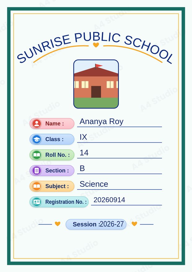
With the Front Page Maker you can try a layout in seconds: pick a design, pick a text template, and change colours or move parts of the page until it feels right. Because the preview updates instantly, it is easy to compare a formal and a friendly version of the same cover before you print.
Quick answers
How many colours should I use?
Two or three main colours are enough: one for the title, one for the labels or border and a neutral for the text.
Should every subject file look different?
It is neater to use one layout for all subjects and change the subject name. Your files then look like a set.
Is a plain cover acceptable?
Yes. A plain, well-spaced cover with correct details is better than a decorated one with errors.
Pick a tone, choose one of the four layouts, leave plenty of empty space and keep the details readable. Those four decisions do more for a senior-school cover than any amount of extra decoration.
Open the free A4 Front Page Studio →