 A4 Front Page Studio
Science Project Front Page Design: Layout, Fonts and Examples
A science project is judged on its content, but the first thing a teacher sees is the cover. In physics, chemistry and biology files the cover has a particular job: it should look clear, serious and orderly, because those qualities are exactly what a science teacher hopes to find inside. This does not mean the page must be boring. It means every design choice should serve readability and show that you take the subject seriously. This guide covers what to put on a science cover, which layouts suit each branch of science, how to treat diagrams and pictures, and which small mistakes to avoid.
What a science cover should show
Besides the usual details, science files benefit from a few extra items that help the teacher identify the work quickly.
- Subject name. Physics, Chemistry, Biology or General Science, in clear large type.
- Project or experiment title. A specific title such as “Effect of Temperature on the Rate of Dissolving” is better than “My Project”.
- Class, section and roll number. Always, and in the same place on every file.
- Teacher’s name and session. As your school requires.
- Board or internal exam name, if the file is part of an assessment, such as Internal Assessment or Practical File.
If you are unsure which items your school expects, check the longer list in our guide on what to include on a cover page.
Layouts that suit science files
The clean formal layout
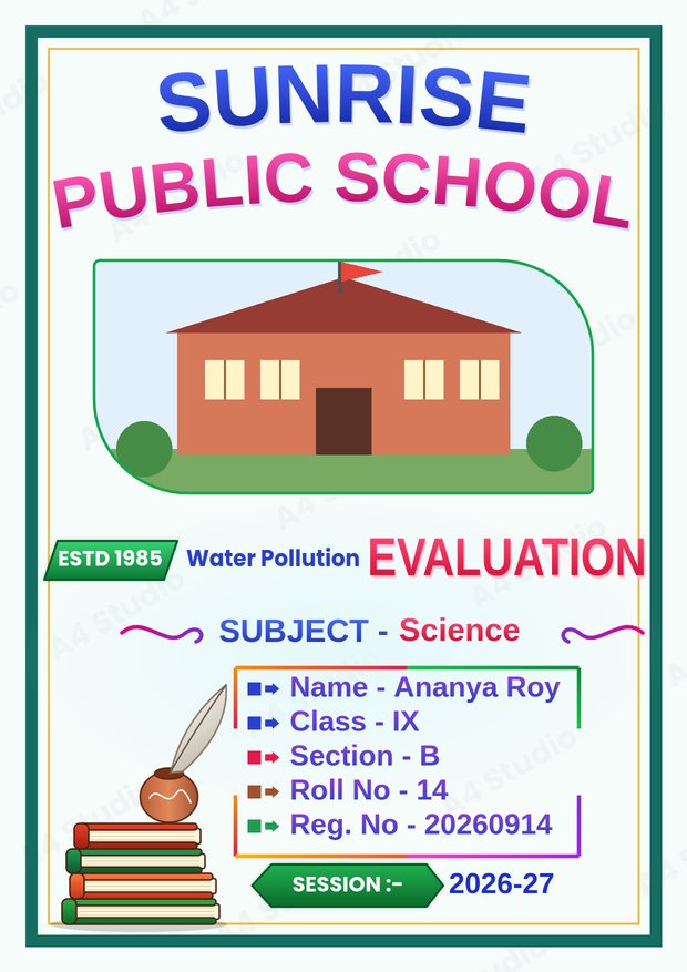
A plain border, the subject name at the top, the experiment title in the middle and a tidy details block below. It is the safest layout for practical records and board submissions.
The title-banner layout
A coloured banner carries the subject or exam name, and the title sits just below it. This helps when the experiment title is long, because the banner separates the label from the title.
The photo-led layout
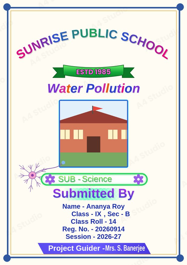
A photo box near the top can hold a picture of the apparatus, the school laboratory or the school building. Use a clear, well-lit photograph and keep the box in proportion.
Small touches for each branch
| Subject | Colour idea | Decoration idea |
|---|---|---|
| Physics | Navy and light blue | Simple geometric lines or a thin grid |
| Chemistry | Teal and orange | A small flask or hexagon motif |
| Biology | Green and cream | A leaf or simple cell outline |
| General science | Blue and green | A neutral border with a small icon |
| Environmental science | Deep green and sky blue | A tree, a drop or a globe |
Keep any motif small and quiet. The aim is to hint at the subject, not to fill the page with clip art.
Diagrams, photos and the cover
Some students want to put a diagram of the experiment on the cover. It can work, but only under strict conditions:
- Use one simple, clean diagram, not a complex labelled figure.
- Keep it away from the details block so the text stays readable.
- Make sure it is sharp. Small, low-resolution diagrams look blurry when printed.
- Do not copy a diagram without permission; draw your own or use one your teacher has provided.
For most files, a clear title and a tidy layout are stronger than a diagram on the front. Save diagrams for the inside pages, where they belong.
Typography for a scientific look
A plain, modern sans-serif font in the details block reads as precise and professional. For the title, a bold version of the same family looks consistent and serious. If you want a little more character, use a slightly rounded or decorative font for the school name only. Our guide on choosing and pairing fonts explains how to keep the combination clean.
Colour and contrast
Blue, green and teal are natural choices for science, but the key rule is contrast: near-black text on a pale background. Avoid neon colours and very dark backgrounds, which use a lot of ink and can look heavy. Read more in our colour combinations guide.
A worked example
Imagine a class 9 student preparing a biology project on water pollution. A suitable cover would have the school name at the top, a photo box with the school building, the title “Water Pollution” in large green letters, the subject “Biology” just below, and a details block with name, class, section, roll and registration number. At the bottom: the teacher’s name and the session. The palette is green, cream and navy text. The page has plenty of space, one picture and no more than two fonts.
Printing a science cover
Science files are often bound or put in a folder, so leave a slightly wider margin on the left. Print on plain white A4 paper, set the scale to 100 per cent and check the first copy before printing many. See how to print an A4 front page correctly for the full list of settings.
Making it in the tool
In the Front Page Maker you can choose a design, pick a text template that includes the fields you need, such as subject, section and registration number, and fill them in. You can also add a photo, change colours and move any element before you download the page as a PNG or PDF.
Mistakes to avoid
- A vague title such as “Science Project”
- Decoration that makes the page look childish for senior classes
- A blurry diagram on the front
- Unequal spacing between the subject, title and details
- Leaving out the registration number when the board needs it
Quick answers
Should the cover show the aim of the experiment?
Not usually. Put the aim on the first inside page, and keep the cover to the title and the identification details.
Can I use a picture of the apparatus?
Yes, if the picture is clear and well lit, and it sits in its own box away from the text.
Do all science subjects need the same cover?
Using one layout for all your science files keeps them looking like a set; change only the subject name and colour accents.
A strong science cover is clear, specific and tidy: a descriptive title, correct details, a calm palette and one simple picture at most. Get those right and the first page already tells the teacher that the work inside is careful.
Open the free A4 Front Page Studio →