 A4 Front Page Studio
Front Page Colour Combinations That Work (and Print Well)
Colour is the fastest way to make a cover page look either cheerful and organised or loud and confusing. Students often pick colours they like individually, such as pink, orange and bright green, and then discover that together they hurt the eyes. A good palette is not about expensive taste. It comes from a few simple rules about contrast, quantity and print behaviour. This guide explains how to pick a palette, gives several combinations that work for school projects, and shows what to check so the colours look as good on paper as they do on a screen.
Three rules that solve most colour problems
- Use few colours. Choose one main colour, one accent and one neutral. That is enough for almost any cover.
- Make the text easy to read. Dark text needs a light background, and light text needs a dark one. Middle tones against middle tones fail.
- Repeat colours. If the title is dark blue, use the same blue for the border or labels. Repetition makes a page feel planned.
Give each colour a job
- Main colour: the title, the border or a large band.
- Accent colour: small highlights such as label pills, a ribbon or an underline. It should appear in small amounts only.
- Neutral: the text and the background. Near-black text on near-white paper is the most readable pairing of all.
Palettes that work for school covers
| Palette | Mood | Good for |
|---|---|---|
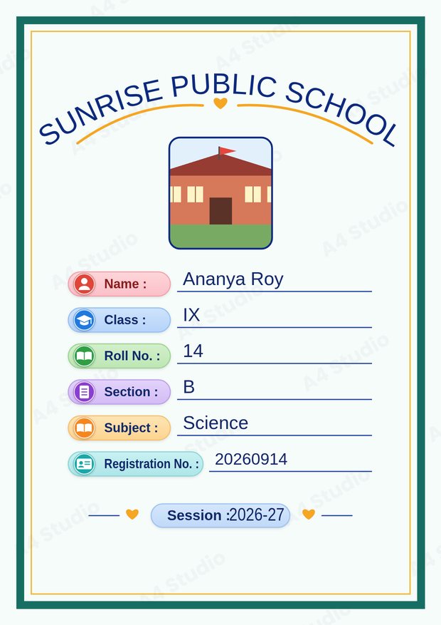
| Navy blue + gold + white | Formal, trustworthy | Board files, science, mathematics |
| Teal + orange + white | Modern, energetic | Computer science, commerce, general projects |
| Deep green + cream + warm yellow | Natural, calm | Biology, environmental studies, geography |
| Maroon + soft gold + cream | Classic, academic | History, English, civics |
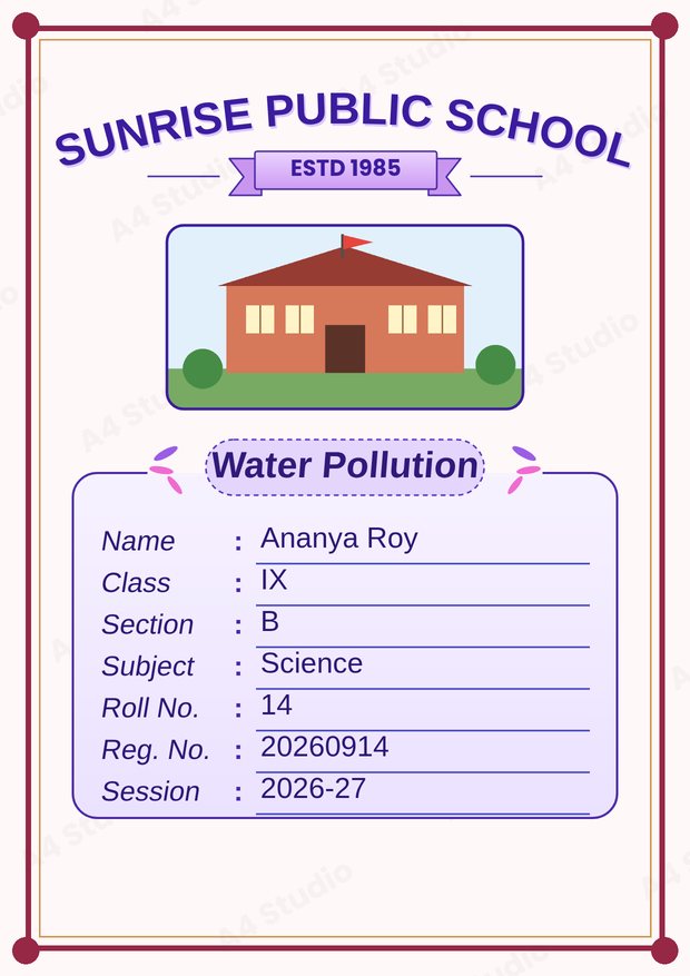
| Purple + lavender + white | Soft, creative | Art, languages, creative writing |
| Sky blue + green + white | Fresh, open | Geography, junior classes |
These are starting points. Adjust the exact shades until the page feels balanced, but keep the roles the same.
Contrast: the rule you cannot skip
Contrast means the difference in lightness between the text and what is behind it. High contrast is easy to read; low contrast is not. Here are quick tests.
- Squint test. Squint at the page. If any text vanishes, increase the contrast.
- Greyscale test. Imagine the page printed in black and white. If the text would disappear, the colours are too close in lightness.
- Distance test. Hold the page at arm’s length. If you cannot read the roll number, make it darker or bigger.
Yellow text on white, light pink on white and neon green on cream are common failures. Use those colours for decoration, never for words.
Backgrounds
A pale or white background is the safest. It prints cleanly and leaves the text in charge. Dark backgrounds can look striking on a screen but use a lot of ink, can make the paper feel soaked and often show banding on home printers. If you like a coloured background, keep it light and soft. If you want a dark band, keep it narrow, such as a header or footer strip, and put pale text on it.
How colours change when printed
Screens create colour by emitting light, while printers mix inks on paper, so printed colours are usually a little duller. Very bright, saturated colours, such as pure neon green or electric blue, often print flatter than they look on a phone. Test with a single page before printing a stack. Also remember that cheap paper absorbs more ink and makes colours look darker. Our guide on printing an A4 front page correctly covers paper and quality settings.
Keep it readable for everyone
Some readers find certain colour pairs hard to tell apart, especially red and green. Do not rely on colour alone to carry meaning. For example, if you use coloured label pills, make sure each pill also has a clear text label, which is the standard approach in most templates. Strong contrast between text and background helps everyone, including people reading in poor light.
Changing colours in the tool
In the Front Page Maker there is a Colours mode on the editing screen, so you can adjust the colours of the page without redrawing anything. Try your main colour first, then the accent, and check the preview after each change. You can undo any change, so experimenting is free.
Colour mistakes to avoid
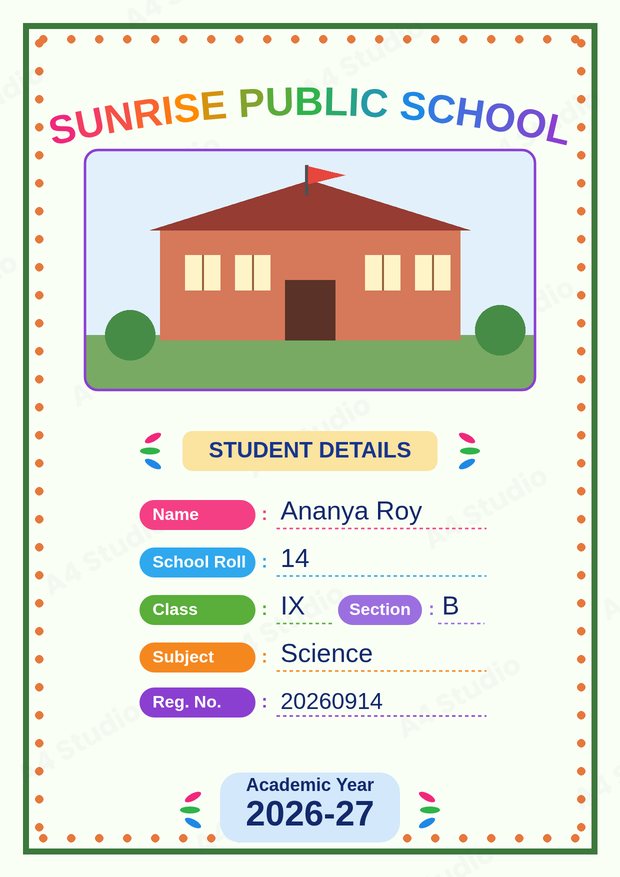
- Using more than three main colours
- Putting light text on a light background
- Using a busy picture behind the details
- Choosing very dark backgrounds that waste ink
- Colouring every label differently without a reason
- Never testing a print before making many copies
Quick answers
What is the safest colour for text?
Near-black or very dark navy on a white or cream background. It reads clearly in every situation.
How do I save ink?
Choose a pale background, use colour only for the title, border and labels, and print in standard quality for drafts.
Can I print in black and white?
Yes. Check that the text is dark and the background is light, and the page will still look neat in black and white.
Choose one main colour, one accent and a neutral, protect the contrast of every word and test a print before making copies. That is all it takes to get a cover that looks good on the screen and on paper.
Open the free A4 Front Page Studio →