 A4 Front Page Studio
Geography Project Cover Page Ideas for Maps, Models and Files
Geography is one of the most visual school subjects, so students often feel they should decorate its project covers heavily with maps, globes, mountains and clouds. A little of that goes a long way. The best geography covers pick one clear theme, such as a sky, a landscape or a map outline, and then keep everything else simple. This guide gives cover ideas for geography projects, from map-style layouts to sky and landscape themes, with advice on pictures, spacing and legibility. It also shows covers made in our free tool so you can see how each idea looks on a real A4 page.
Pick one theme and stay with it
A geography cover looks best when it has a single visual idea. Choose one of these and let it lead the design:
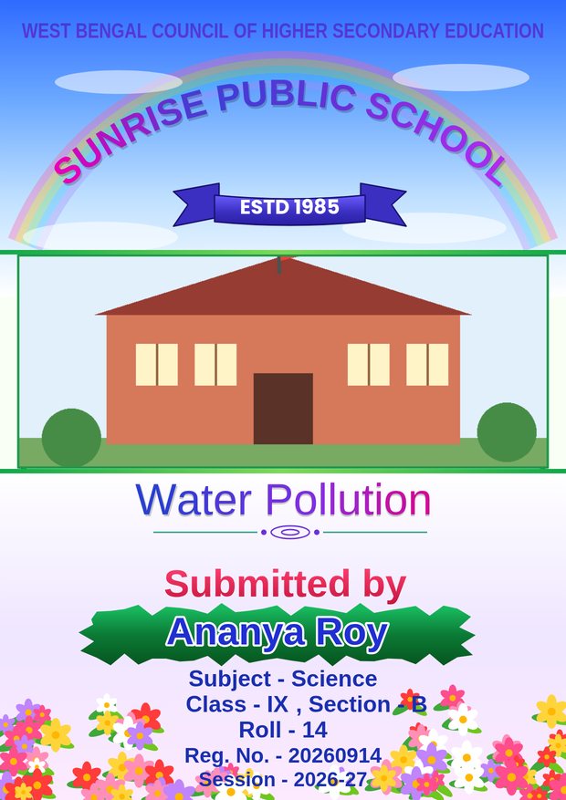
- Sky and clouds. A soft blue sky at the top with the school name in an arch. It is cheerful, works for almost any geography topic and keeps the lower half of the page free for details.
- Landscape. Hills, fields, a river or a horizon line across the bottom. It suits topics about land use, agriculture, rivers or the environment.
- Map outline. A simple outline of a country, a state or the world in a pale tone behind the title. It suits regional studies, population and resource topics.
- Globe or compass icon. A small, tidy icon beside the title for a clean, modern look.
Match the cover to the topic
| Topic | Theme | Colour idea |
|---|---|---|
| Rivers and water | Landscape with a river line | Blue and green |
| Climate and weather | Sky and clouds | Sky blue, white and soft yellow |
| Population and settlements | Map outline | Warm neutrals with one accent |
| Agriculture | Fields and horizon | Green, gold and cream |
| Natural disasters | Plain, serious layout | Navy and grey, little decoration |
| Resources and minerals | Map or icon | Earth tones |
For serious subjects, such as natural disasters, choose a quiet cover. A cheerful rainbow on a project about floods or earthquakes would feel out of place.
Using maps on the cover
If you want an actual map on the front page, follow these rules:
- Use a simple outline, not a detailed political map with tiny labels, because small text turns to mush when printed.
- Make the map pale or semi-transparent when it sits behind text, so the words stay readable.
- Draw the map yourself or use an outline you have the right to use. Do not copy a copyrighted map from a book or website.
- Keep the proportions of the country correct. A stretched map looks wrong immediately.
Photos and the school picture
Many covers include a photo or a logo near the top. For geography, you could also use your own photograph of a local landscape, a river you visited or the weather instrument you used for the project. Choose a bright, sharp picture and crop it to fit the box instead of stretching it. A single good photo is better than three small ones.
Spacing and legibility
A decorated sky or landscape is only half the page. The other half must stay clear for the details block. Place the title and details over plain areas, not over clouds or hills, and keep the text in dark colours. If any text sits over a decorated part, check that it is easy to read. Leave at least 10 to 15 millimetres of margin all around, so that no printer clips the border. Our guide to printing an A4 front page correctly explains why margins matter.
Colour choices
Geography suits natural colours: blues for water and sky, greens for land, warm yellows and browns for deserts and soil. Keep to one main colour and one accent so the page does not become a rainbow. When you want brighter colour, put it in the title or a small ribbon and keep the background pale. See our colour guide for palettes that read well on paper.
A worked example
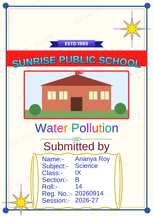
Suppose a class 8 student is making a project on “Rivers of India”. A good cover would use a pale sky at the top with the school name in an arch, a photo of a river in the middle, the title in large dark-blue letters, and a tidy details block with name, class, section and roll. A thin green border frames the page, and the session sits at the bottom. The cover uses blue, green and cream, one picture and two fonts.
Making a geography cover in the tool
In the Front Page Maker you can choose a design with a sky or landscape feel, pick a text template with a title and subject line, and type your details. Add your own photo in the photo box, adjust colours and move any element until the layout is balanced. Because the page updates as you type, you can see right away if a title is too long for the space.
Mistakes to avoid
- Filling the whole page with clouds, mountains, a globe and a map at once
- Placing small text on top of a detailed picture
- Stretching a map or photo out of proportion
- Using a cheerful style for a serious topic
- Using a low-resolution picture that prints blurry (see how to fix a blurry print)
Quick answers
Can I draw the cover by hand?
Yes, if your teacher allows it. A neat hand-drawn map or landscape can look excellent, but keep the title and details clearly written.
How big should the title be?
It should be the largest text on the page and readable from a few steps away.
Should I include the date of the fieldwork?
Only if your teacher asks for it. Otherwise, the session year is enough.
Pick one theme, keep the details area clean, use natural colours and make sure the title and your information stay easy to read. Do that and your geography cover will look thoughtful rather than crowded.
Open the free A4 Front Page Studio →